Tearing it all down and rebuilding it
The organization presented us with a formidable task: to implement sweeping changes and completely reimagine the front end of our user experience funnel. This went beyond a mere redesign of our core website; it required a comprehensive overhaul that would not only align us with industry standards but also propel us beyond our competitors. Such challenges are rare in the careers of most UX professionals, so we were determined to excel and deliver outstanding results.
So why were we doing this?
The focus on quickly adding legacy 2U and new product content after the 2U/edX merger resulted in disjointed business-centric experiences that limit our agility to deliver on a customer-centric platform strategy.
Problem
edX performance is declining in various aspects such as LOB leads, verification rates, retention, and revenue.
Hypothesis
The organization has lost touch with learners and the modern e-commerce industry, resulting in outdated user experiences.
Our Approach
To re-establish a customer-centric approach, we needed to gain a better understanding of users, the market, and the current edX marketplace experience. To do so, we performed a nine-week series of UX exercises, including preparation, a digital garage, and a design sprint that focused on customer research and design thinking.
Part 1: Digital Garage
Part 2: Design Sprint
What does success look like?
Increased empathy for our customers
Identification of our customers’ biggest pain points
An understanding of the most impactful problems to solve
Lots of innovative ideas to explore
Some winning concepts – on which to test and iterate – that will feed into our reimagined platform vision

Digital Garage
The Digital Garage involved the design and research teams as well as a multitude of stakeholders across the organization. The goal of the workshops was to build empathy for our users and develop a shared understanding of the users’ decision making needs and pain points.
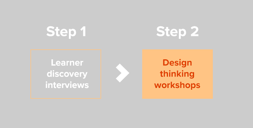
Step 1: Learner discovery interviews
A series of user interviews to develop a user-centered strategy for the edX Marketplace, emphasizing understanding the early discovery phase leading to enrollment - the key decision points, needs at each stage, pain points, and opportunities.
The research team performed 10 total interviews where Coursera/Udemy users walked us through their journey from defining their learning needs all the way to enrollment.
Each interview produced a baseball card summarizing the user’s experience and a journey map from discovery to conversion.
Step 2: Design thinking workshop
A series of collaborative design thinking workshops to gain a shared understanding of users based on qualitative data collected in learner discovery user interviews.
User Interviews
Baseball Cards
Discovery research takeaways
Social media platforms are a common gateway that leads users toward a learning platform in their learning journey.
Users need structured course page content to be able to quickly find key selling points to make an informed decision.
Reviews and free trials help users build confidence in their decision making process.
Discounts and financial aid opportunities serve as an effective push to get users to make their final course purchase selection.
Design thinking workshop
Next, the research, design and stakeholder teams used the affinitized notes, baseball cards, and journey maps from the learner discovery user interviews as source material for several design thinking exercises. Each exercise produced an individual artifact that helped the team hone in on user needs and pain points.
The output of the Digital Garage included:
Museum Walk
Empathy Mapping
Journey Mapping
Personas
HMW Statements

Design Sprint
After extensively building empathy for our users and working through the design thinking workshops, the design team was ready to reimage the edX marketplace.
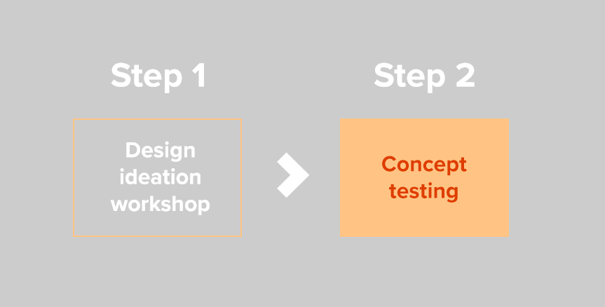
Step 1: Ideation workshop
The broader cross-functional team from the Digital Garage worked together to ideate on rough concepts based on ideas generated within the design thinking workshops.
Step 2: Concept & RITE testing
The design team developed low fidelity concepts that were then validated by the research team through user testing.
Rapid iteration testing and evaluation. Research and design teams worked closely together to perform additional testing on designs where iterations were quickly implemented between each user interview session to further refine the design concepts.
Ideation workshop
For initial design ideation, the participants of the Digital Garage worked through several design ideation exercises to kick-off the design sprint.
Creative Matrix
Creative Matrix where concept ideation was generated based on prior Problem Statements and then sorted by enablers.
Crazy 12’s
Crazy 12s where twelve concepts were quickly mocked up and then star voted on.
Another Lens
“Through Another Lens” Ideation where we were inspired by sites outside of edX and the online education market.
Lo-fi designs & prototype
The design team took the best ideas from the workshops and designed 7 concepts to take into user validation testing.
Concepts created:
Home page, Product page, Course preview, Reviews, User profile, Pathways AI chat tool, Pathways home page
Concept testing
The research team performed moderated interviews to test the design concepts with users
The research team took the newly designed concepts and conducted 7 moderated user research sessions where users provided feedback.
The goal of the research was gauge user interest in each concept, gauge how useful each concept would be in the decision making process, and understand what functionality users would expect from each concept.
Overall, the concepts tested really well. Users liked the modules on the traditional homepage as well as the new course card design and felt that the product pages gave them everything they needed to make a decision.
The research also helped us make a decision on the style of the homepage design as users preferred the traditional style and felt that the Airbnb style homepage was better served as the course catalog page.


